ZAHA HADID MESNER MOUNTINE MUSEUM
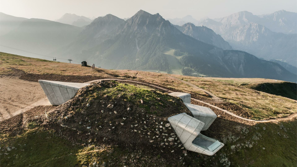
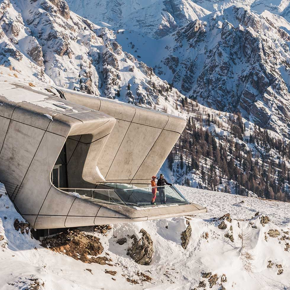
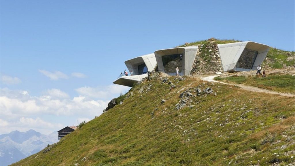
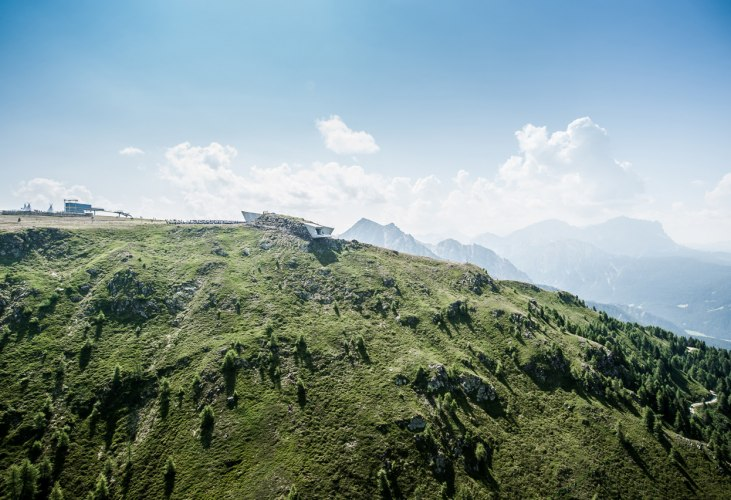
This building embedded at the top of the Kronplatz mountain in the center of South Tyrol’s most popular ski resort , was inaugurated in July 2015,
This modern building inmersed in the mountine landscape in the brilliant way that has been done, has many aspects to talk about suchas as for example, how the inside of the museum is iluminated, symetry or balance, movement, color and texture, contrast, scale or even rpoportion
PLANS
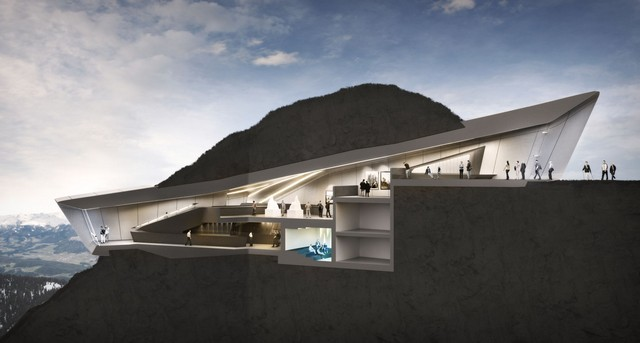
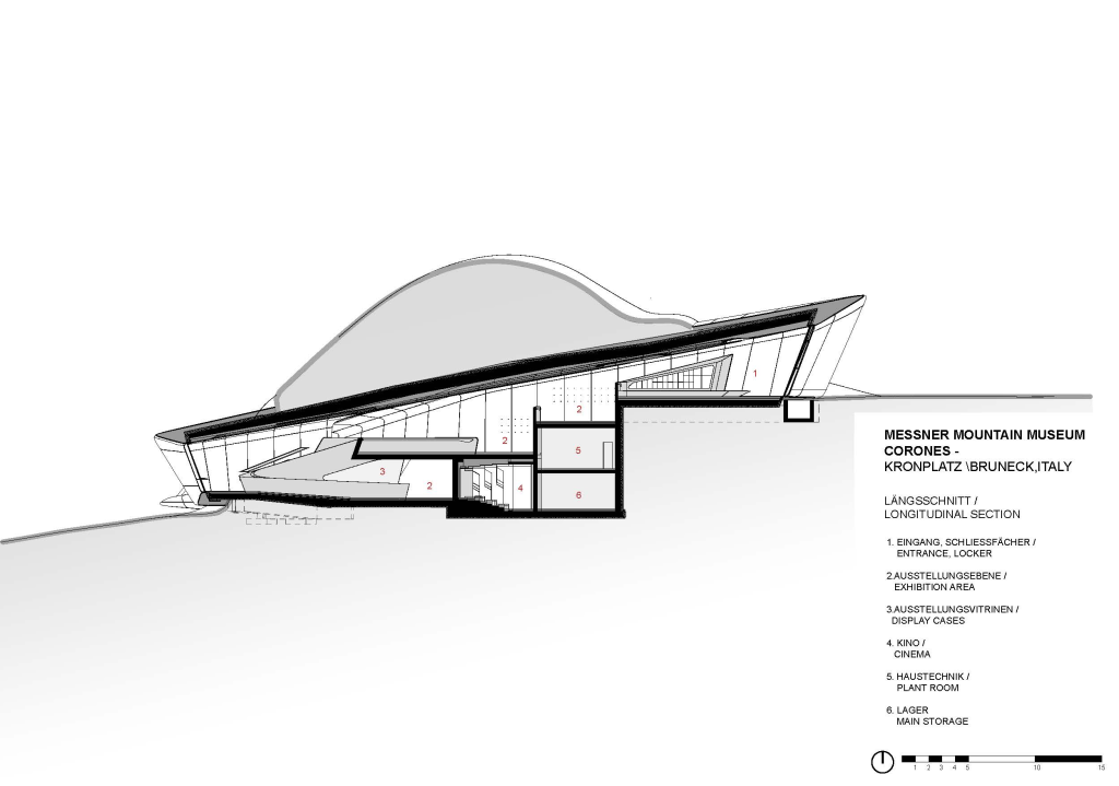
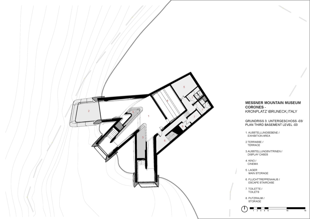
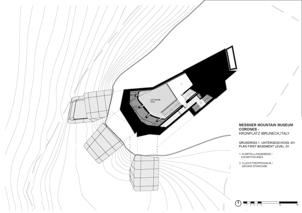
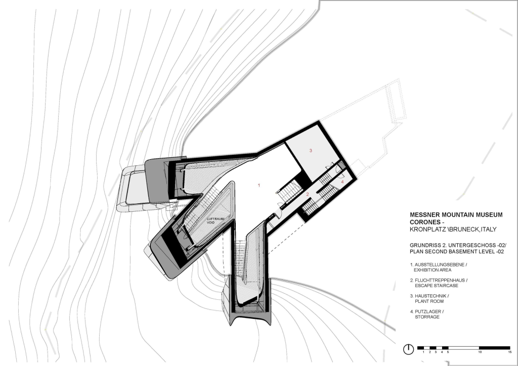
RULES OF COMPOSITION OF THIS BUILDING IN TERMS OF FORM
SYMETRY
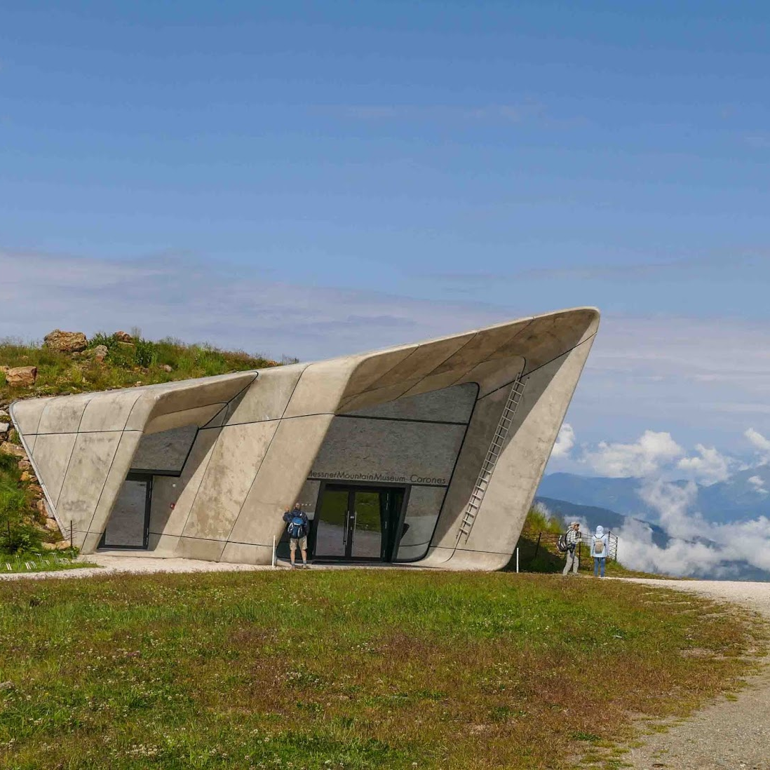
As we are able to apreciate, this building is not simetric at all, it seems to be quite because of the only use of concrete for the materials of the building or even because of the form but it is not. at least from the outside, because ni the inside it looks quite symetric
COLOR, MATERIAL AND TEXTURE
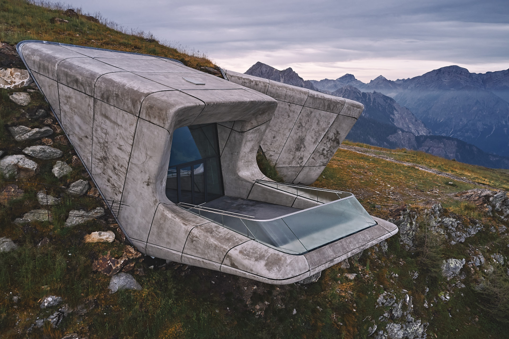
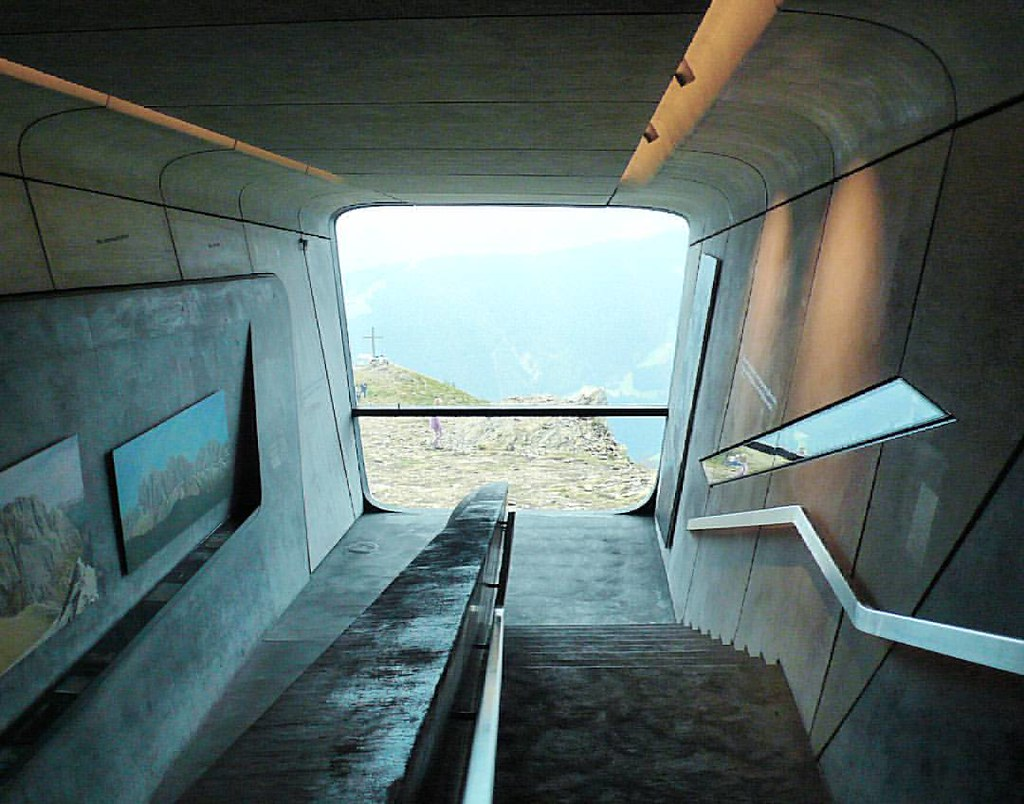
As the unique material is concrete, the main colour is grey. The architect selected concrete mainly beecause of the colour and the texture of it. By the use of concrete, the architect could inmerse the building or camuflate it in the landscape whith out interfering in it which was the aim of this construction. The straight forms but mainly as well as the colour and texture that the material gives, correspond properly to the landscape.Apart from concrete, glass is also distinguished as a material, in the case of the windows or even in the case of some showcases inside the museum. Apart from these two materials, not many more are distinguished because that is what the architect Zaha Hadid wanted. These two would be the main materials
LIGHT
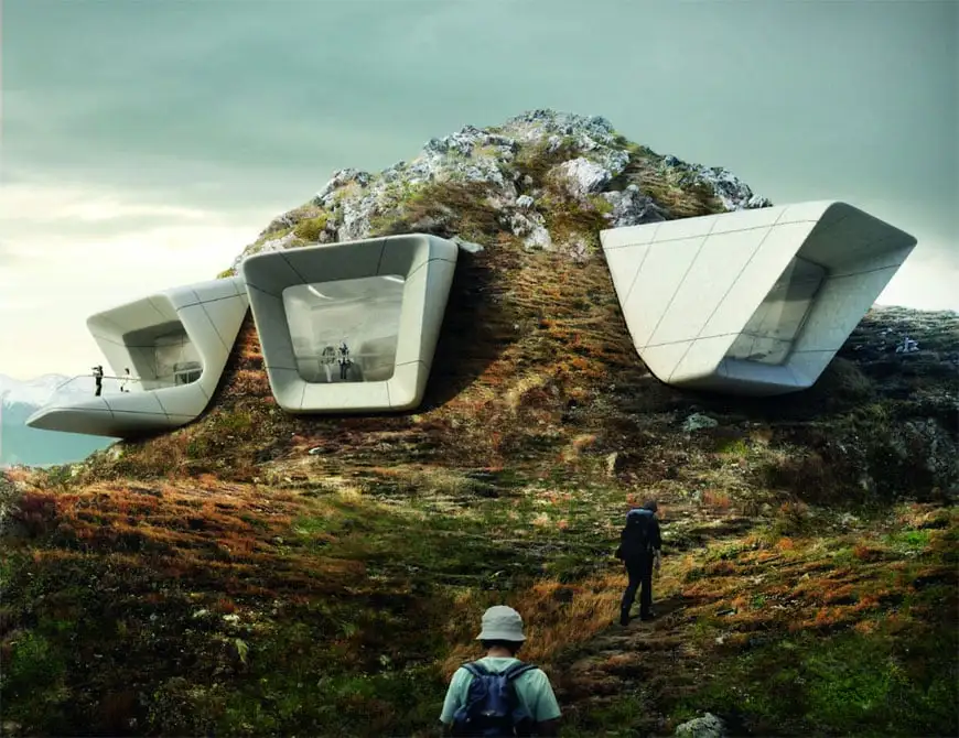
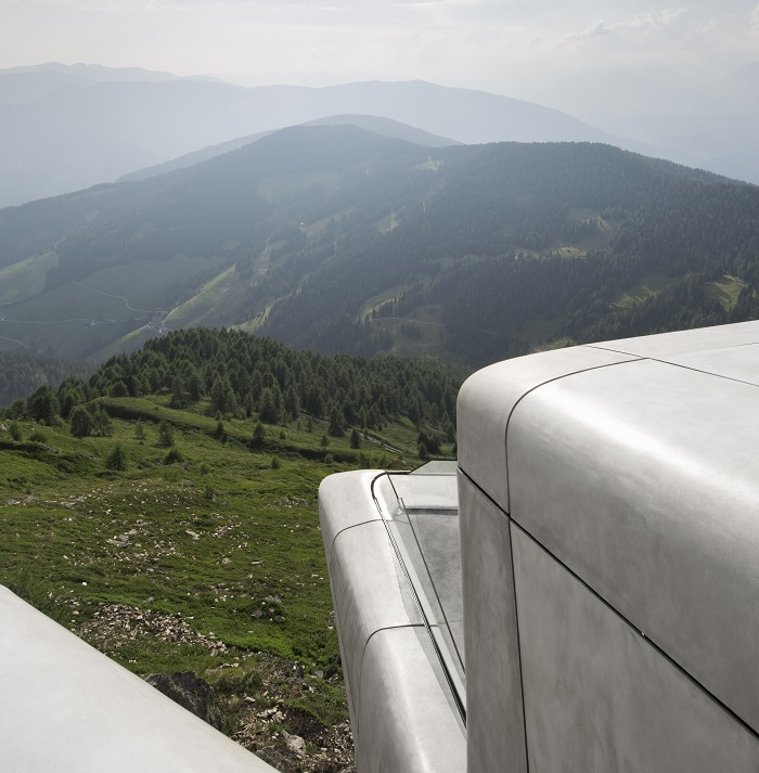
In spite the building gives the senssation of being insede of the mountine like if we where talking abou a cave, this museum has several openings to the exterior. So despite at first it seems to be a darck inside whit no natural lighgt, thats not exactly the case. The inside of this building which allso sseems to be small but it is not, is perfectly iluminated whith natural light combined whit some artificial but taking as much profit as possible of the natural light.
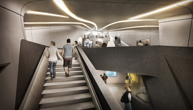
The three openings provide a good natural light due to its positioning and thanks to the height at which the museum is located. but as for the artificial light that the architect wanted to provide, it is worth mentioning the design. Trying to hide as much as possible the spotlight so that only the light is perceived, with a futuristic and beautiful design as well as simple. It consists of an elongated line, plays with the shape of this, sometimes curved and sometimes straight, following the patterns of movement.
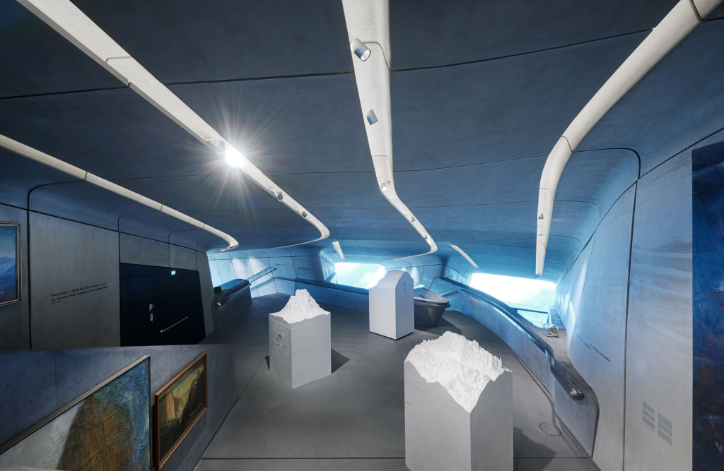
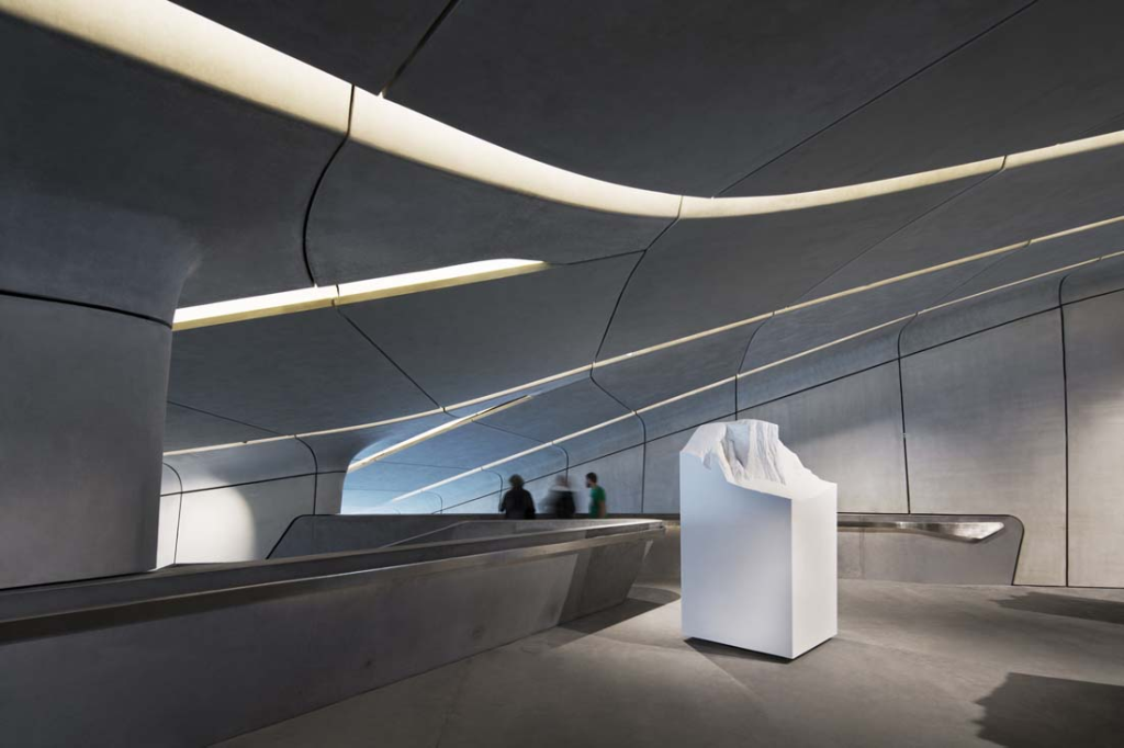
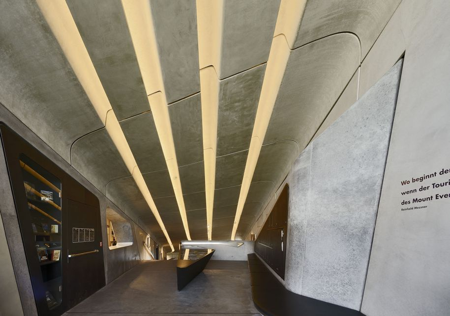
An other aspect to deep in, is de unity . If we were able to remove the top of the mountine, we could perfectly apreciate that te building seems to be an agrupation of square or rectangle prisms, for example the three lateral openings which while it seems to be three different and independent pieces from the outside, these are joined on the inside to other piece making a single structure.
UNITY
So in terms of unity, we could say that what it seems to be three different and independent structures from the outside, it is in fact a single structure, but sice it is within the mountain and we are only able to see these three openings, it feels like there is no unity
MOVEMENT
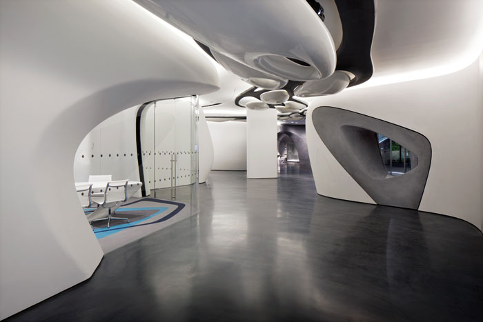
In terms of movement, as we can see in the following pictures, Zaha Hadid included some movement patrons such as de lines for the light which indicates more or less the path we should follow in our visit to the museum, as well, we are able to see how the stairs, railings, curves, etc creates a sensation of movement inside the building

SCALE
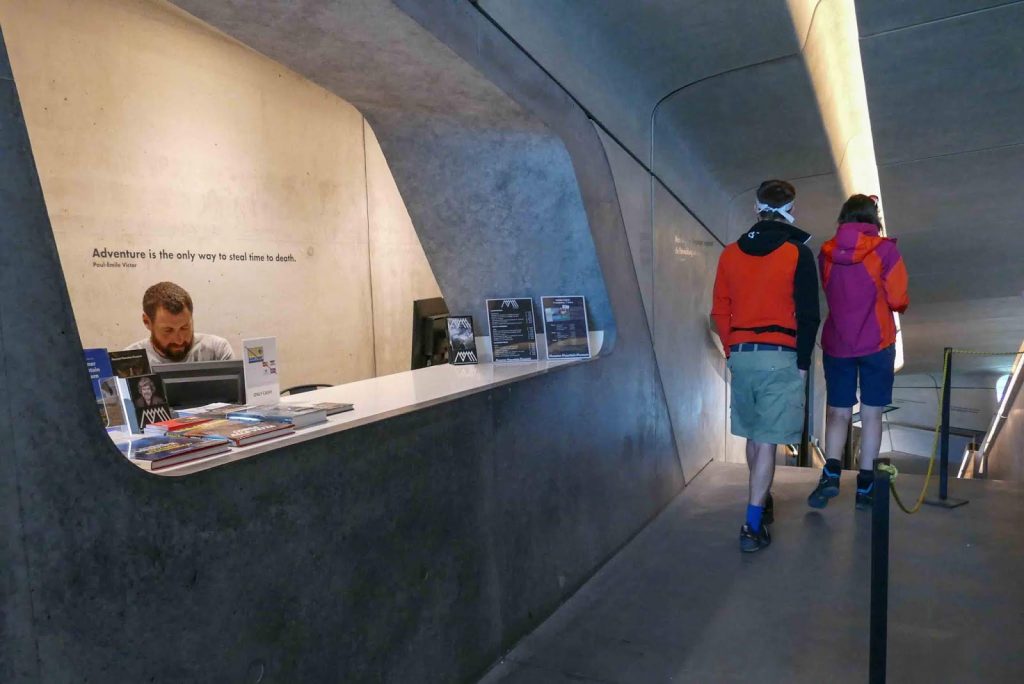
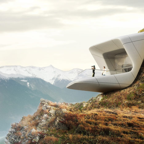
As well, this museum it is quite well scaled as if we see it in site, it is not to big to stand out from far away although it is not to small to go unnoticed from the distance. Moreover, in comparison whit the human scale, as we are able to see, in the inside the buildings seem to be quite low like a cave. That is done by purpose by the architect in order to create the session of being inside the mountine like a cave as it is at the end of all.
CONTRAST
As for the contrast, as we know, the architect tries to camouflage the museum in the mountain and its landscape through the use of concrete and the shape of the museum (similar to the rocks but with modernism) together with the immersion of the museum in the mountain. This is why it does not contrast much with the exterior but if we look closely we can appreciate differences. Also if we look at the contrast of the interior with the exterior, we will see that they are two completely different worlds, when you are inside it seems that you are in the future, it is a modern place, but when you go out you see nature, two worlds that collide.
With what does contrast is with the vegetation outside that comes out in spring, but we also see that depending on the time of year, contrasts more or less
